One of the variables of my sensor is “sample_errors”. This is an integer value which is usually 0, and never reaches higher than 1. However, it’s displayed by the “chart” widget as a floating value, and with different values as well. Sometimes 0.50, sometimes 0.33, usually 0. While the raw sensor data itself in the device variable overview is displayed correctly (0 and 1).
See:
Am I using the widget incorrectly or is this a bug in your widget?
Thanks in advance.
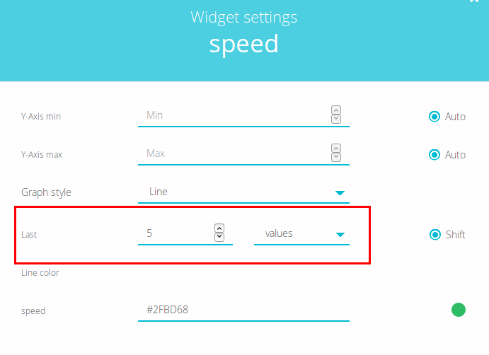
Greetings, please make sure that you are setting a fixed number of values to plot:
All the best
Hi,
Setting it to fixed values works for the accurate representation. However, my setting was:
7 Days
I would assume this would still represent the data correctly, but it doesn’t. Why does the Days representation not work, but the Values representation does?
And is this going to be fixed? Because the values representation doesn’t show enough points for 7 days… which I would like…
Greetings, it is not an issue, it is an expected behavior.
When you set a time range you get a tendency representation of your dots. It is not possible to know how many dots you have in a time range, i.e in an hour you would have hundreds of dots but another user would have thousands or tens of thousands, and, to plot that amount of values in a chart can reach in a very poor performance of your browser. Because of this, Ubidots limits the number of dots to plot per chart to 500.
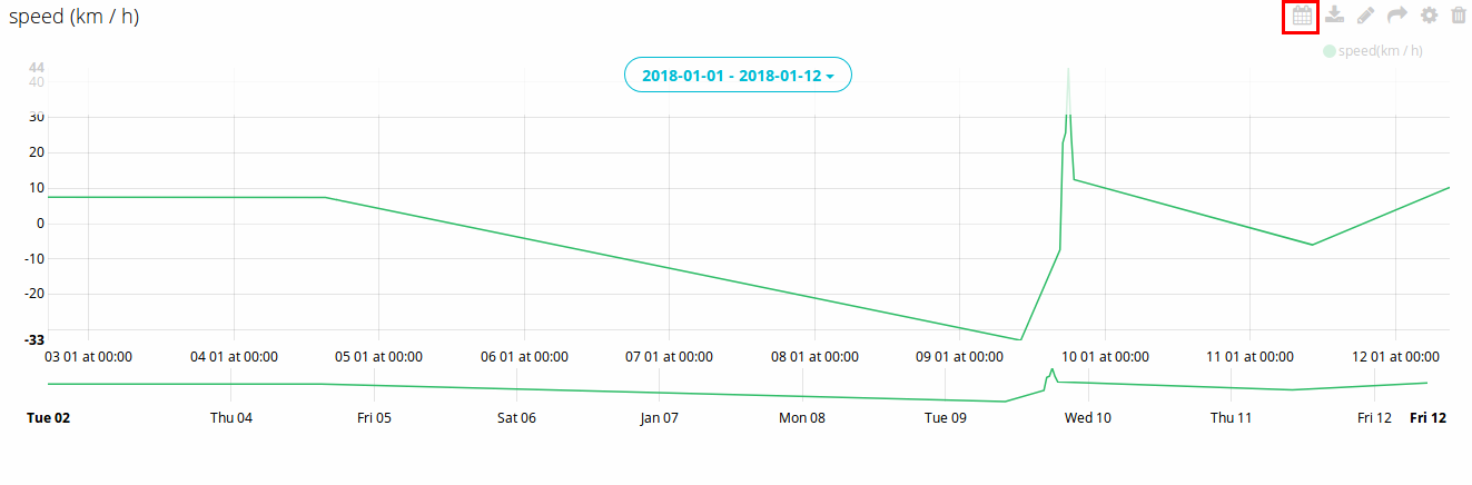
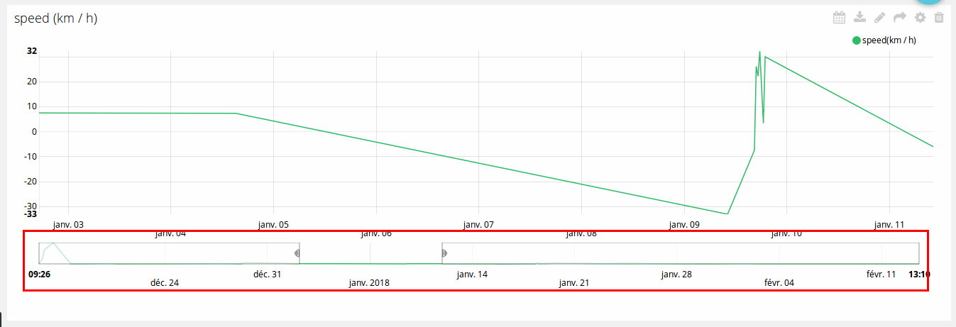
If you set a date range to plot, you will get an average of the dots in that date range (a tendency representation), that is why you get 0.5 or 0.33. If you wish to see the raw data when you set a data range, please use the zoom utility in the bottom of the chart:
All the best
Thank you for your answer! At first I didn’t get it, because I use multiple 7-day representations of my data for other variables, and they seem to work well. But I think I get it now:
The reason why this tendency representation is so weird is because the data isn’t constant. The errors happen now and then, most often they don’t, which causes the tendency to work different as opposed to my other charts.
So the basic lesson here: only use time-base charts for data that doesn’t change too quickly and data that has a consistent interval.
Thanks!