I’m plotting multiple variables on a Chart widget. The X axis is time. I have data from two variables that is posted a few seconds apart. When I look at the data in Devices, it shows the correct timestamps, with one value posted a few seconds after another one, but on the Chart, these two values are posted in the wrong order, with the earlier one plotted later than the first one.
The behavior presented is unusual. I just performed a test on my side to replicate the presented behavior but everything works fine.
Based on this, I’d like to verify the behavior directly on your account. Could you provide me your username and the name of the device you are testing with?
Hello Maria,
The usename is wbphelps. The device is “Cat Door 4”.
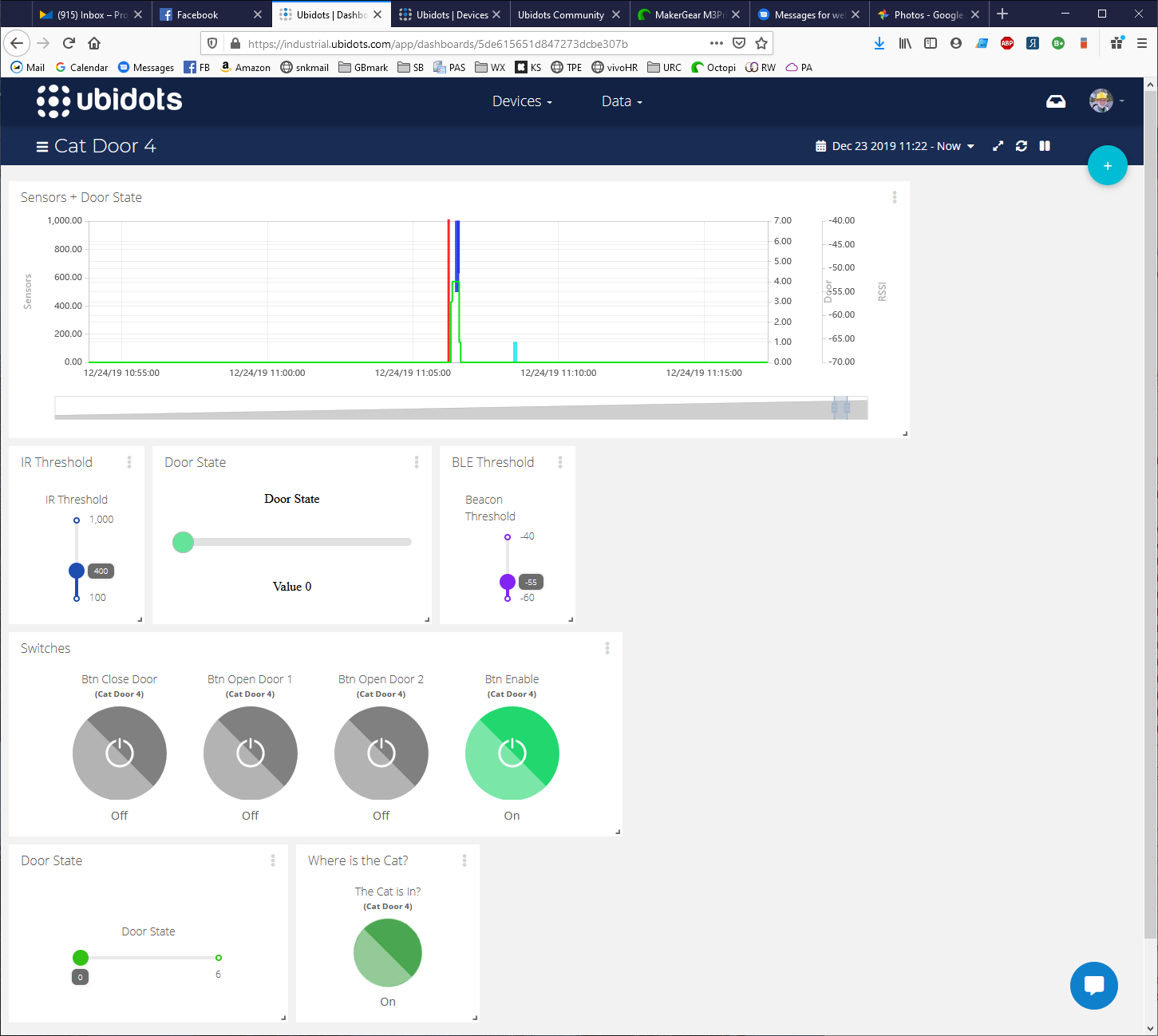
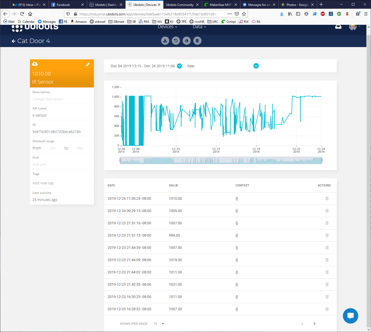
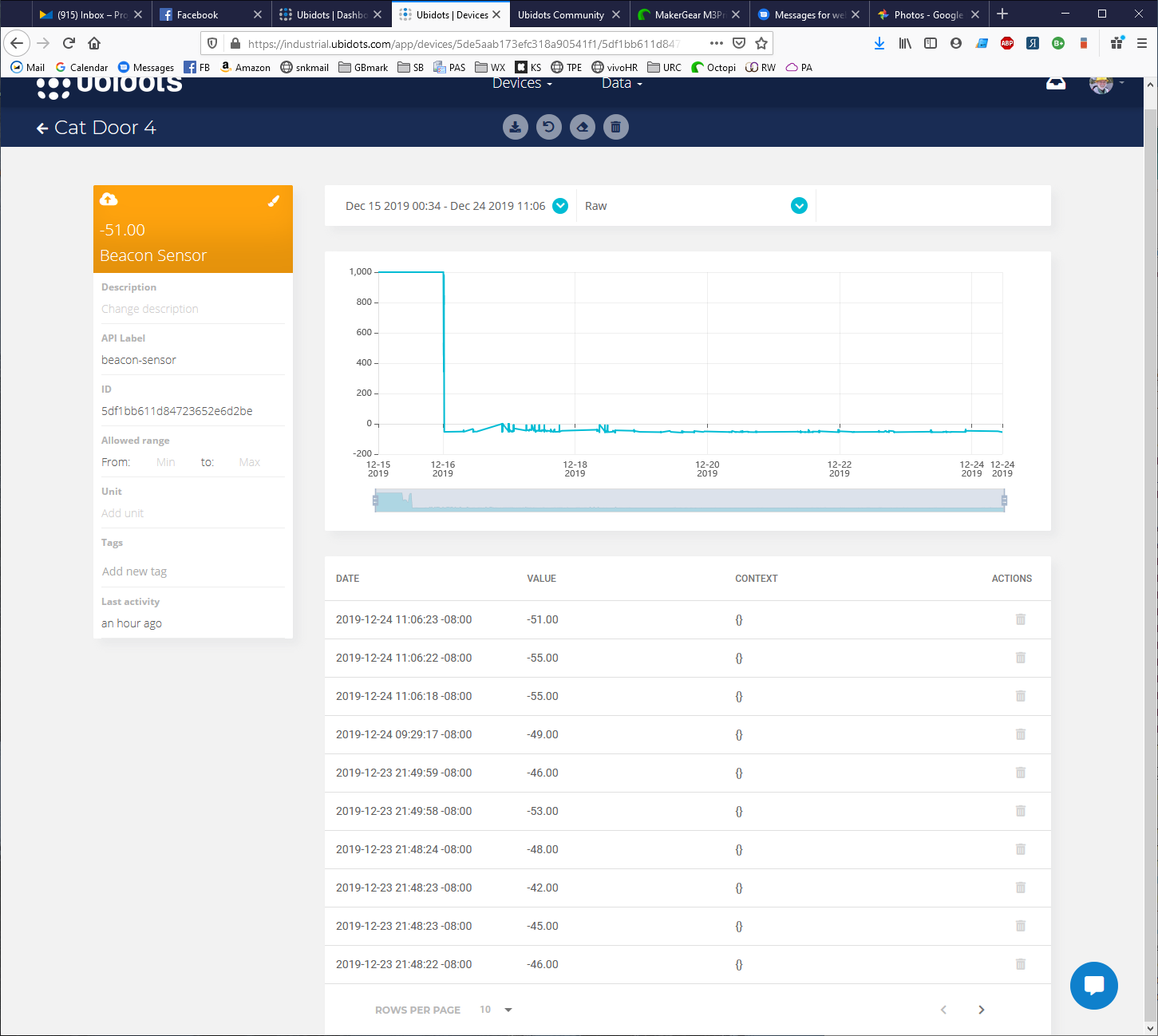
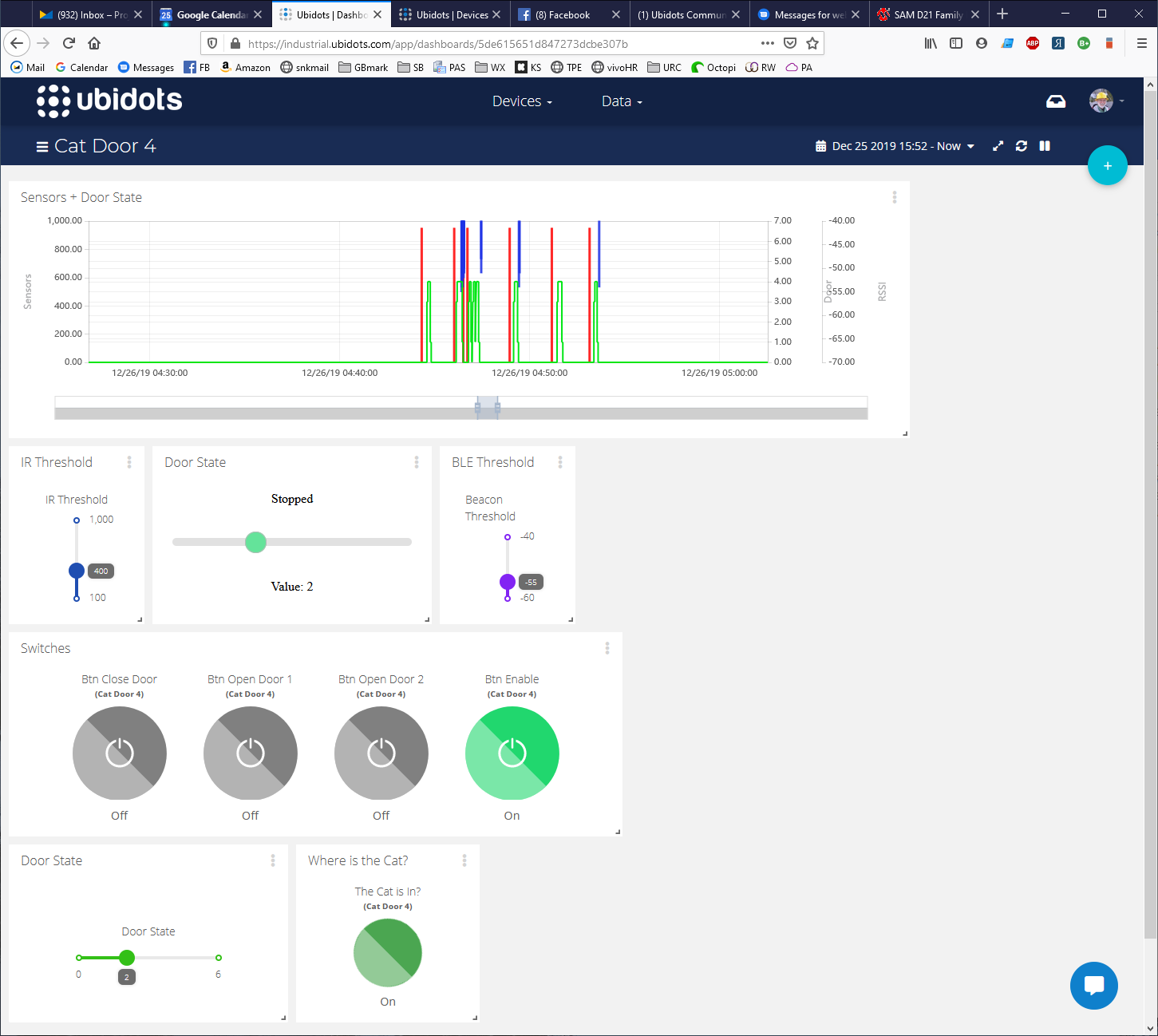
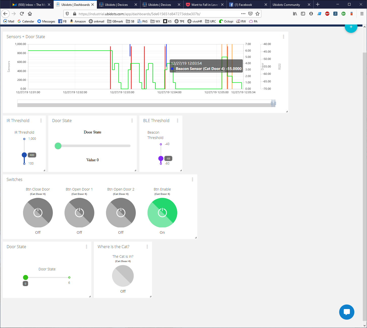
I’ve uploaded 3 screen caps. In dashboard chart the value of “Beacon Sensor” is plotted in purple, and the value of “IR Sensor” is plotted in red. you can see the blue line for “Beacon Sensor” on the chart is after the red line for “IR Sensor”, but in the data for each of the 2 variables you can see that the timestamps for these data points are in the reverse order. The most recent for “Beacon Sensor” is at 11:06:23 and the last one for “IR Sensor” is at 11:06:24, one second later.
The order of these events tells me if Shadow is in or out, depending on which sensor he trips first…
Thanks for sharing the screenshots, they have been very useful.
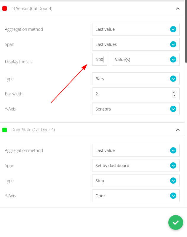
I have been doing some tests on my side and I can see that the values have received correctly. However, under the settings previously set in the widget, I was not able to see the plot of the IR sensor as shown in the chart shared.
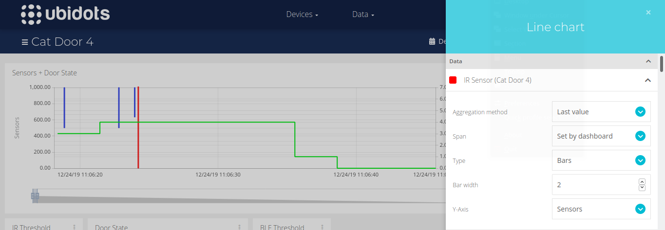
After a detailed review of the widget settings, I changed the span set for the IR sensor to “Set by dashboard” and I was able to see the data plotted correctly.
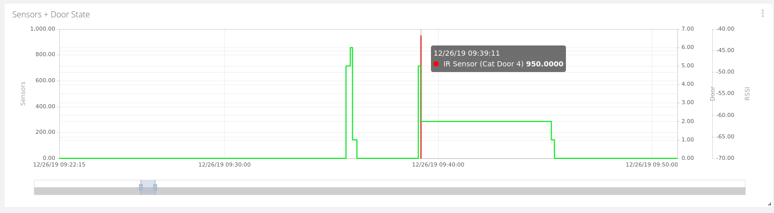
I still cannot get the display to be in the correct order. I changed Span for all of the variables to “set by dashboard”, reloaded the page, and it’s still the same. For example, here is the plot at around 4:53 this morning. it shows the IR event happening first, then the door opening, and then the Beacon. But the data shows this:
Greetings @wbp, please allow me to answer in behalf of my colleague Maria. Our widgets have a special behaviour: If the number of all your variables’ dots to be plotted overflows a threshold of 10000, Ubidots will draw an average of those dots and, as an average, you will not get the raw values of your series and also the timestamps of the plotted values will be linespaced.
From our help center article: should the variable combined dots count exceed 10,000 dots, Ubidots will resample the data, by averaging, every 5 minutes, 30 minutes, and so on, to ensure the limit is not exceeded. We implement this to avoid memory issues, imagine that you have in an hour time span 100k of dots, and you have three widgets that should plot this amount of data, you browser and PC simply will hang up and the user experience will be certainly affected. Said this, you have the below options to see properly your variables:
Select a shorter time span, in this way you will retrieve less values and your raw series will be plotted.
Create a chart that plots fewer variables, i.e, a chart with only the IR and Cat Door time series:
you will notice that both variables will be plotted properly
Select a fixed number of dots to be plotted for ALL your variables, in this way you will manage how many dots will be retrieved and can play with the threshold number:
Interesting explanation, but I am doubtful that it fits in this case.
I had changed the chart to plot a 12 hour span. In that time span 10,000 dots works out to 833/hour. I’m not posting anywhere near that many dots.
Also, I was manually changing the time span on the dashboard to a very small subset of the plot, like maybe 10 minutes. The number of events (dots) in that range was on the order of 20 or less!
I will repeat the test today and post more screen captures.
FWIW - I checked my usage stats. For the period in question, the total dots per day is under 2000. If I set the chart range to 6 hours, there is NO way that I could have exceeded 10,000 dots.
So again I conclude that what I am seeing must be due to some other problem. But thanks for trying.
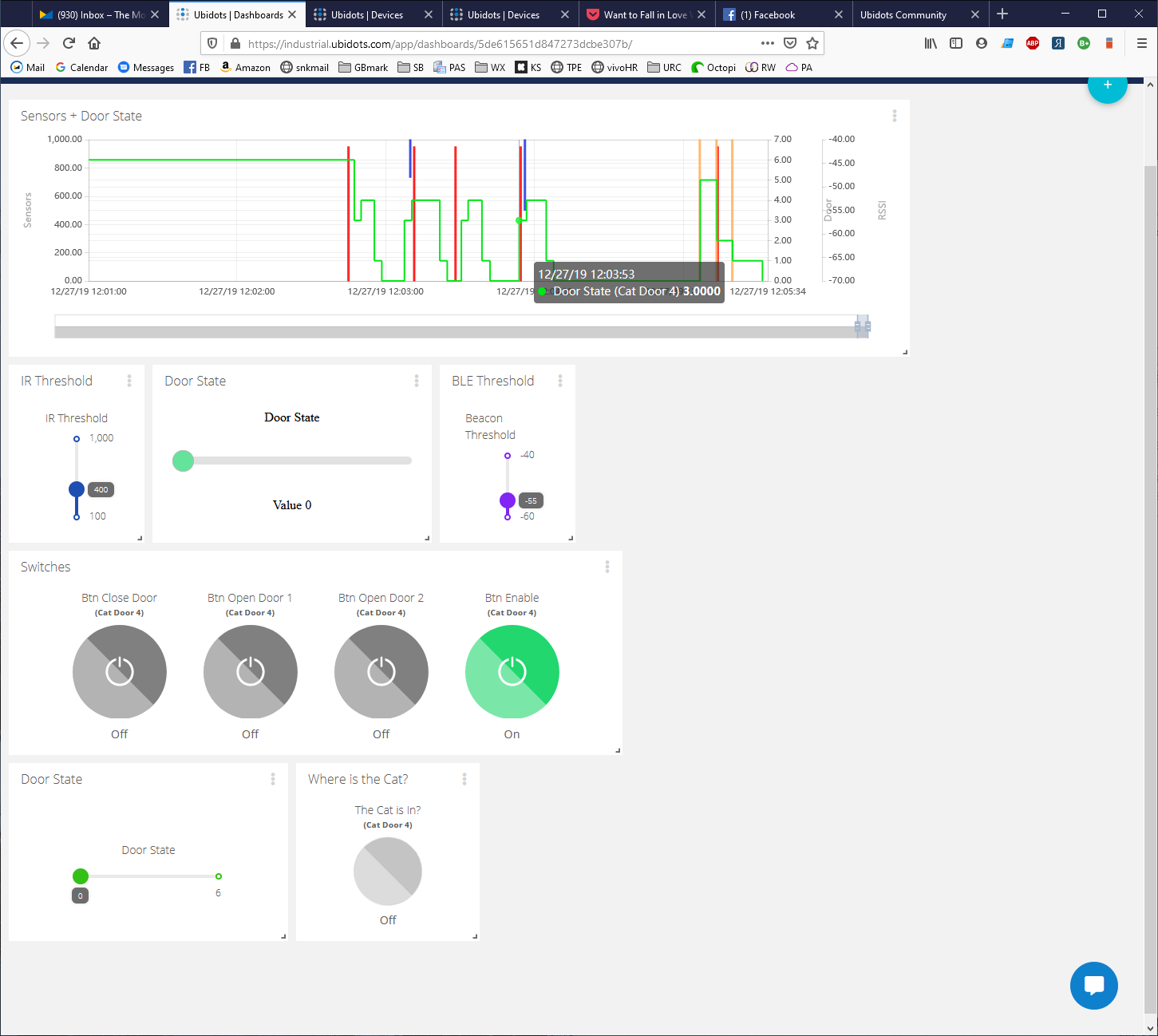
Here are 3 more screen captures, this time of the same chart, with the mouse “hovered” to show the data values. You will note that the blue Beacon Sensor line is after the red IR Sensor line in the chart, but when I hover the mouse you can see that the timestamps are in the opposite order. Clearly the plot is incorrect.
I decided to try creating a new chart with (most of) the same variables and set the time span to 3 hours. Now the events display in the correct sequence. I changed it back to 6 hours and they are still in sequence. So maybe the original chart was corrupted somehow?
Hi there, I don’t think so, I would like to continue with the throubleshooting to discard any issue at our side, can you confirm me if in the screenshot below: