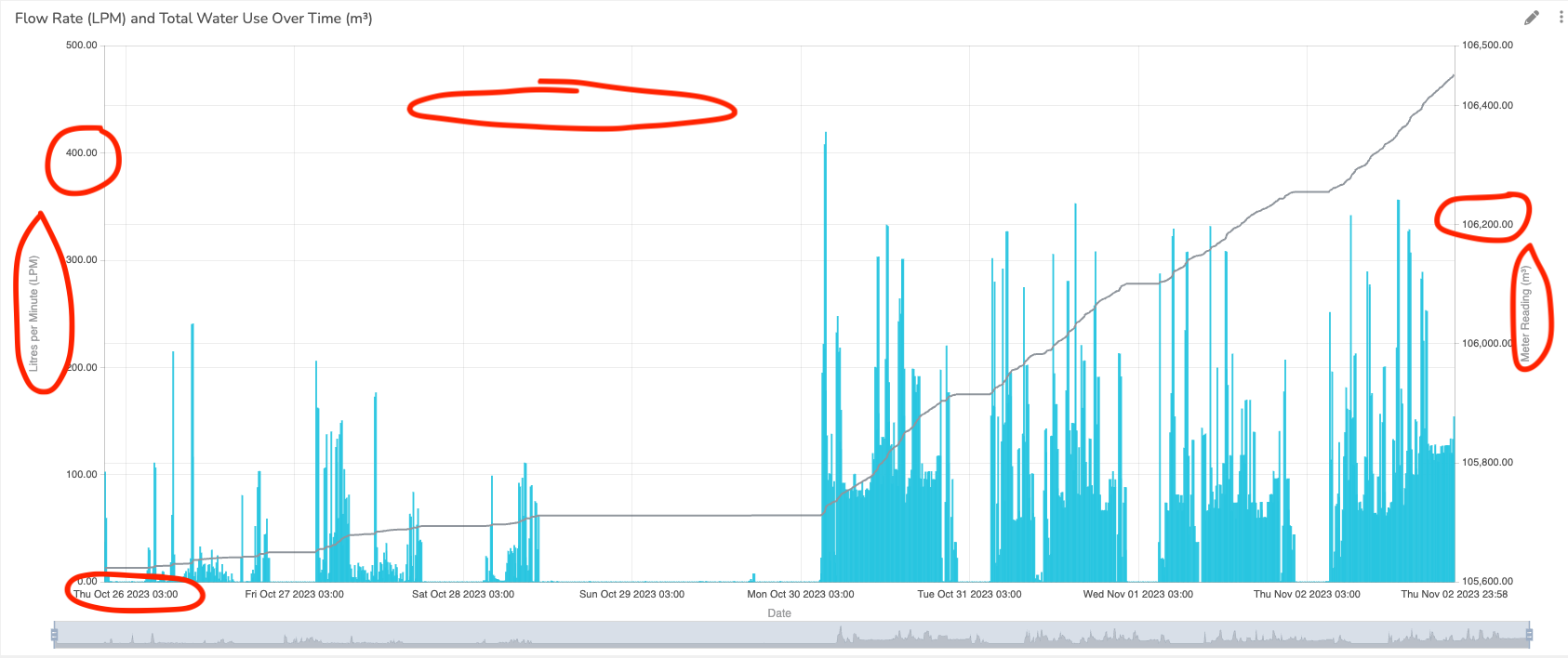
Is it possible to customize chart appearance beyond the header using the Custom Style segment? Based on this post the answer is no, but wanted to see if this had changed or if anything was in the works?
Specifically interested in changing axis font size.
Greetings @qntfy,
I trust this message finds you well.
Could you please share with us the customization level you would be expecting for the widget’s styling, including their header?
The widget’s Custom Style primarily focuses on altering container elements like header color, drop shadow, and background color. It does not affect the content of the widget, namely the chart. For detailed insights, please refer to our Custom Style Guide. However, it is valuable to us to know your expectations, so we can actually check if that’s anywhere in our roadmap
Regarding the Line chart widget, we are planning updates to enhance its customization options, aiming to offer a higher level of flexibility by allowing you to alter the underlying library configuration, which by the way, we use Echarts.
I look forward to understanding your customization requirements more clearly to assist you effectively.