Im trying to display rainfall data on my dashboard from an edn device that transmits pulse counts from a tipping bucket. I had created a synthetic variable to cound the pulses since the last uplink and times by the bucket volume. My synthetic variable looks like this - (diff(count,-1)*0.2) with the output being mm of rainfall for the given sample period (my case is 10 minutes).
I would like to display the rainfall in a bar chart with collumns stacked next to eaxh other on the X axis, one with the 10 minute totals for the past hour, one with the hourly totals for the day, and one with the daily totals for the week. ideally it would be good to be able to show these in different colours within the one chart as well.
Thank you for sharing your question with the community.
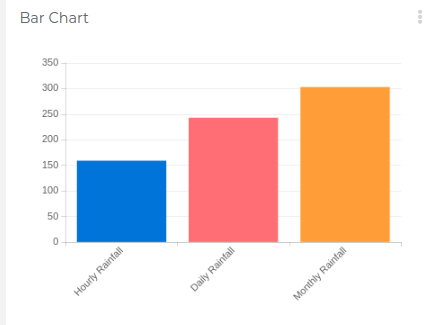
In this case, there are two possible options, one is to create a bar chart widget that shows the value for each specific time range, hour, day, and week, as you can see in the following images.
Note that we used the aggregation methods to sum up the “rainfall_latest” variable in the aforementioned time frames.
The other option is to create an HTML canvas widget to build the logic and graph that you are looking for in case you need to show more than one value per hour, day, or week in the dashboard selected time period
Please let me know if the first option fits your needs otherwise we can explore different options.
thanks for the reply. i was hoping to have a single chart with bars stacked next to each other for each time period. for example, have 30 bars stacked next to each other, with the aggregated daily rainfall totals. can this be done in the dashboard, or is there a variable that need to store this data (e.g day 1 total rainfall = sum of latest_rainfall between 00:01 and 23:59) elsewhere before the dashboard can graph an absolute value.
Or, for this example, is it possible for the dashboard to aggregate for the day as it is already doing, then run that aggregation for each day to create effectively 30 bars next to each other?
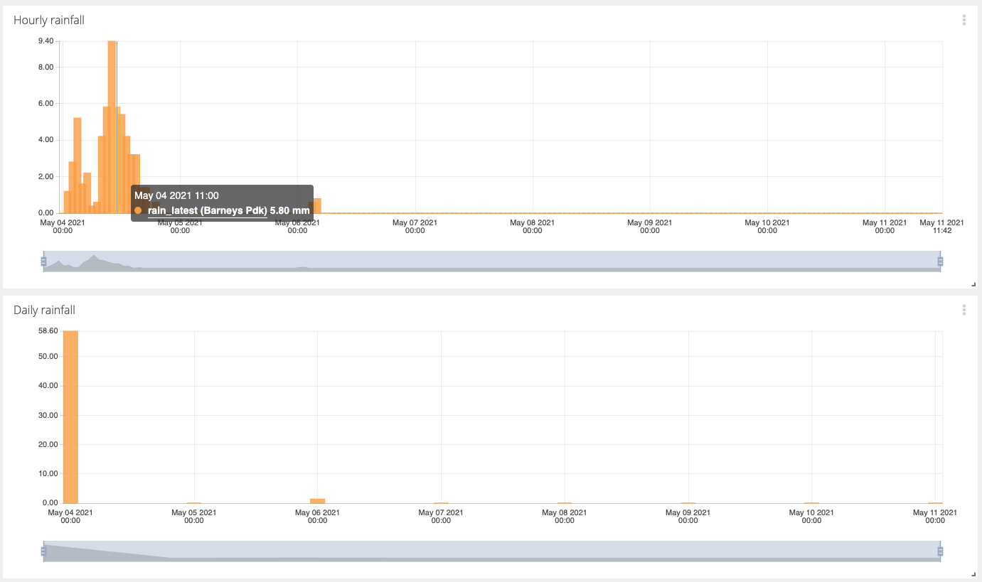
You can have this type of aggregation directly in the dashboard based on your “rainfall_latest” variable. However, you’d need to have 3 separate line charts because this widget doesn’t allow adding a variable multiples time and aggregate it differently in each entry.
Here’s how it would look for the hourly and daily rainfall sum:
For the monthly sum, you’ll need to create an additional synthetic variable with the expression sum(rainfall_latest, "1M") and then use this one in a third line chart set as Last value with Span Set by dashboard, or any other you need.
For the sake of anyone following on behind me with the same problem, I had originally selected the bar chart widget, instead of the line chart widget with its type set to Bars. I’m not sure what the point of the bar chart widget is if the line chart does it’s job? Or is there a scenario in which to use this bar widget?
Great question @windorah ! for those of you who may have the same doubt, you can see it like this:
Line chart: Supports dots, lines or bars. The X-axis is ALWAYS the time domain.
Bar chart: Each bar is the equivalent to a “metric”, which is the last value, max, min, average, count or sum of an Ubidots variable, over a specific time range.
ive been looking on the forum regarding aggregating data over specific time period but havent found an answer. The query is further to the original query in this thread about aggregating rainfall data.
In Australia, the government weather bureau reports its rainfall on a daily basis, with the day starting at 9am. is it possible to report for example ‘todays rain’ or ‘yesterdays rain’ in a dashboard, however have the cut-off between days be 0900hrs instead of 0000hrs?