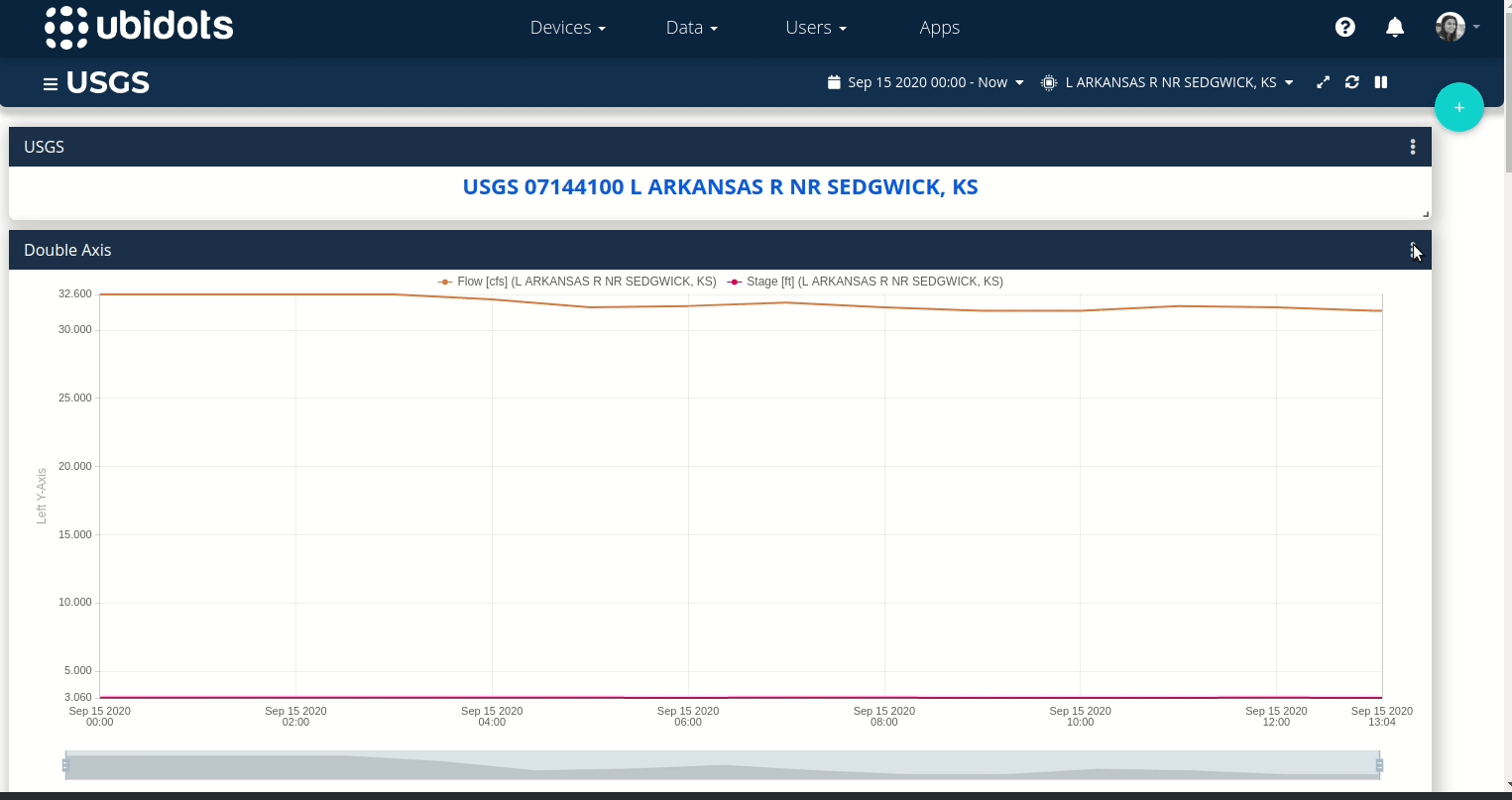
In Double axis or line chart graph, if we set two variable for Y axis with different colour of graphs, with different name set in display,.
Graphs shows different colour, but the name set shows in same ash colour for two variable. Because of this, we unable to identify which line is for which variable.
please set different colour for different name for two variables.
Please receive our apologies for the delay in replying to your note.
Unfortunately is not possible to change the color of the Y axis in the widget, only the color of the variable. To identify the variables you can enable the show legend option.
In case you need the Y axis to change based on the color of the variable, you can create your custom visualization with the HTML canvas widget, please refer to the following articles for more information and examples.