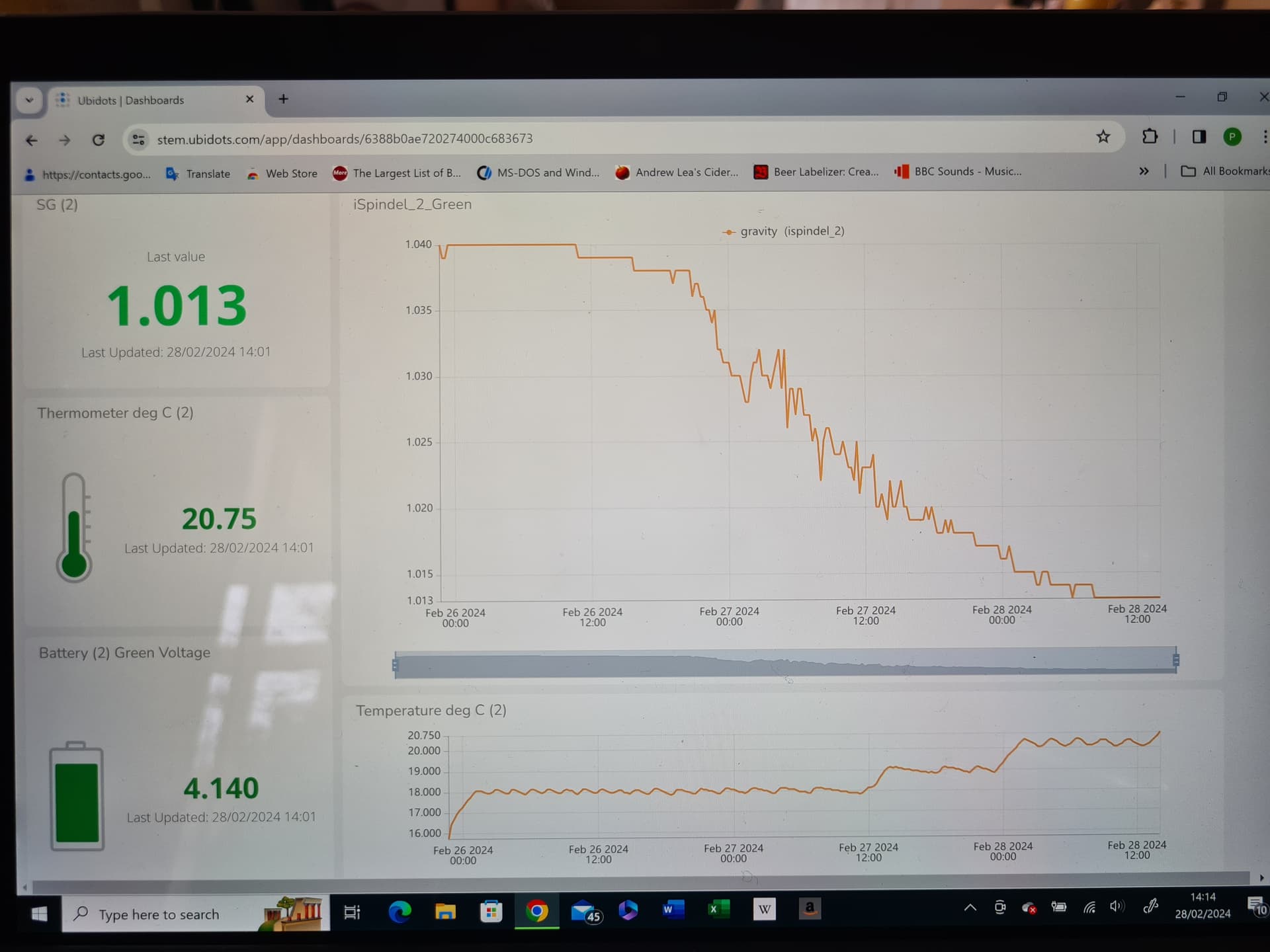
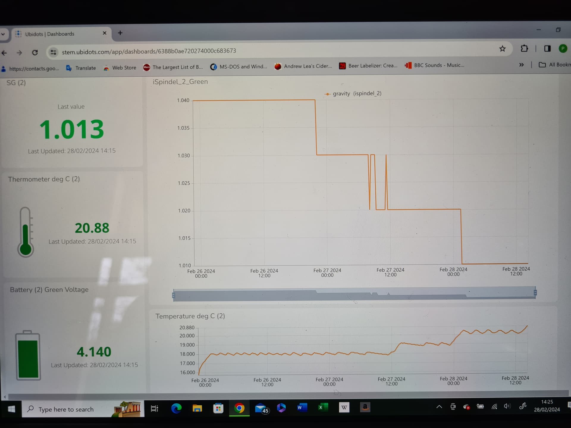
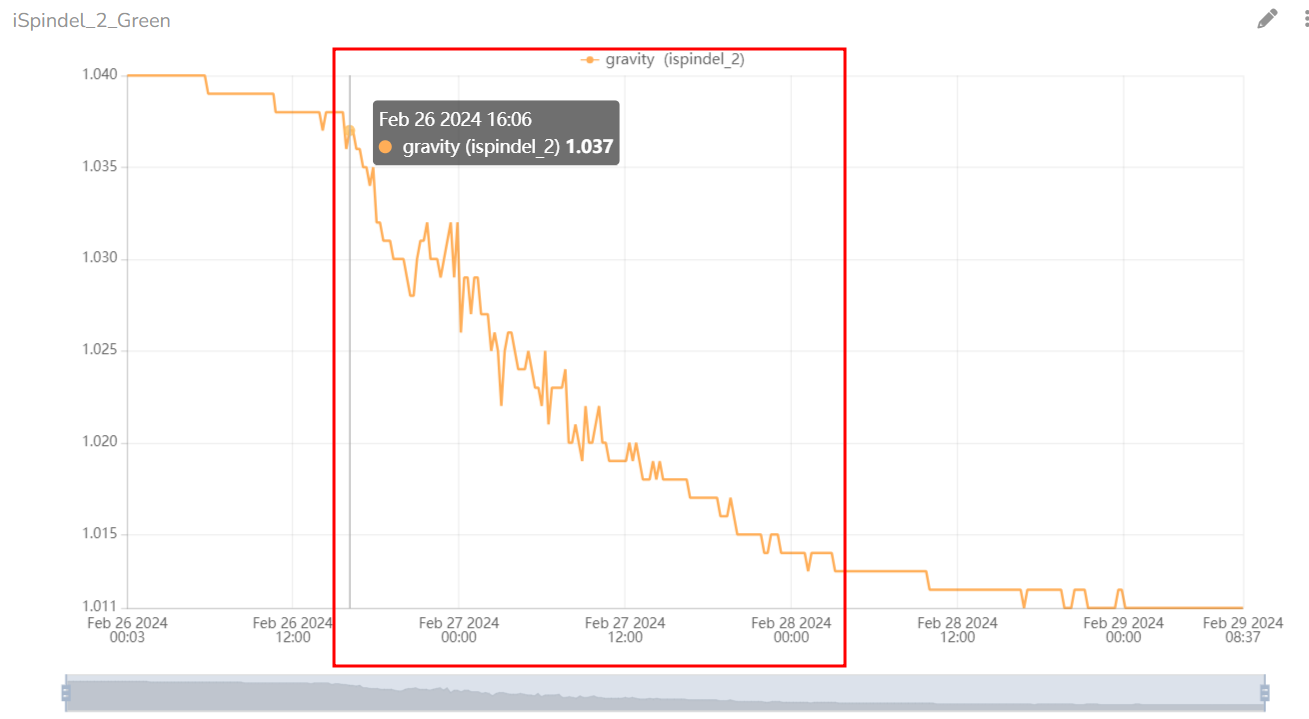
I am a homebrewer using Ubidots to display an iSpindel device to monitor specific gravity and temperature. The attached screenshots show (top) the display as set up and working as intended. After a few minutes however (less than the data send interval) the graph changes to a much coarser step (lower shot). Can anyone suggest why this happens and what I can do to prevent this? I have only a beginers grasp of Ubidots so please give any advice in laymans terms. Thank you.
Hello @Stressman,
Welcome to our Community Forum.
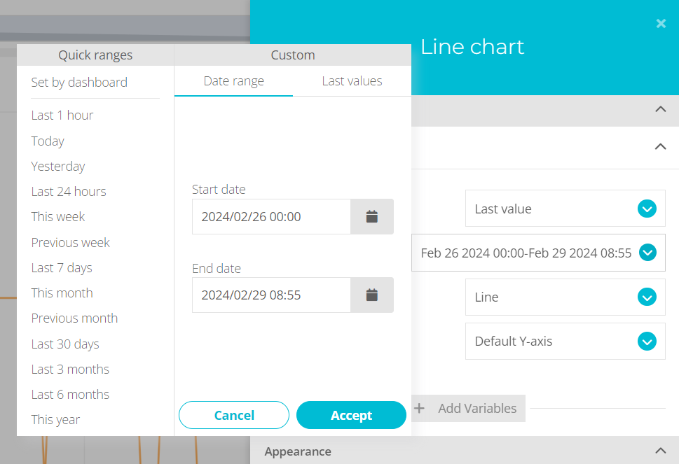
This is not an error; rather, it’s a case of misinterpretation when viewing the graph. For instance, if you specify this particular date range on your dashboard:
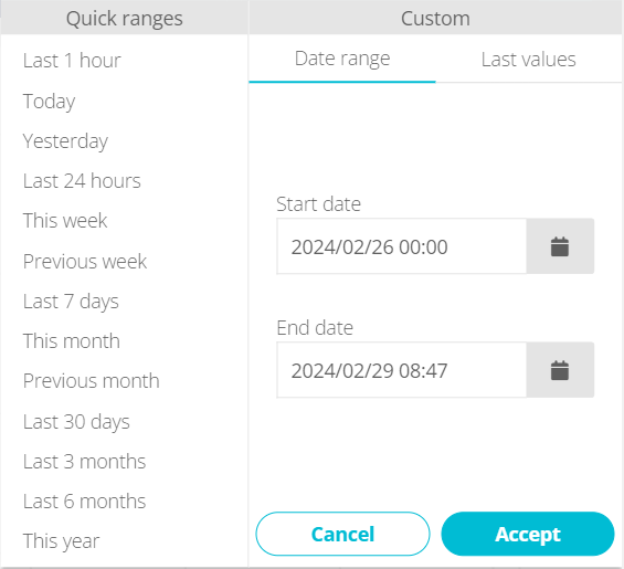
The graph will be displayed as the way you want.
But this is a particular behavior of your variable gravity between february 26th and 28th.
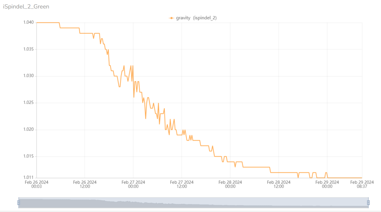
If we modify the date range of the dashboard to the last 24 hours, the graph will look like this:
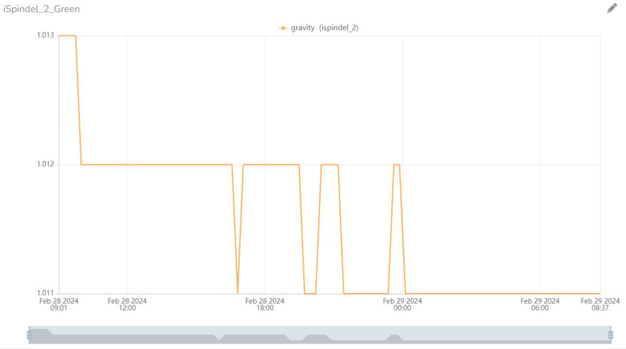
In this scenario, you might not observe all the fluctuations present in the previous graph because the original variable is being updated within a narrow frame. Consequently, the graph adjusts automatically to fit the selected range.
This occurrence is due to the fact that upon editing the line chart, you’ll notice that the widget’s span is set to “Set by dashboard”.
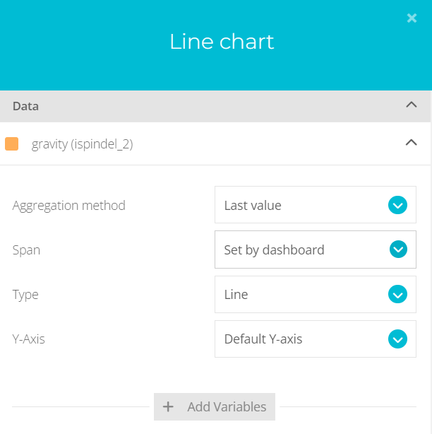
You can select a custom date range for this particular widget and it will always display that range. (the span “This week” would give you a good graph).
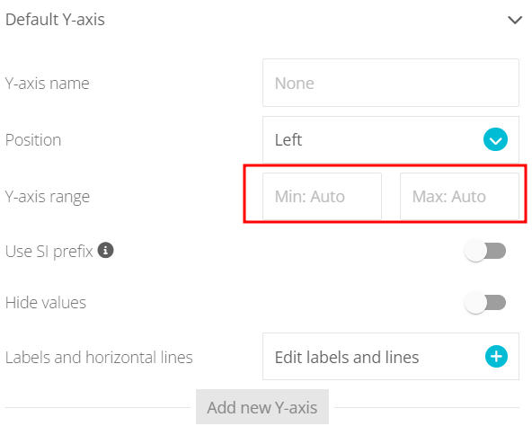
In addition, you’re able to modify the range of the Y Axis of the chart.
Let me know if you need further assistance.
Best regards,
Alejandro
Thank you very much Alejandro for your detailed reply. I’ll look into changing the parameters next time I brew and let you know how it goes. Kind Regards.
Perfect @Stressman,
I’ll be attentive to any question or comment you may have.
Best regards,
Alejandro