I have a chart displaying a single variable. The “Span” set to “last values” and “Display the last” is set to “24” and “Hours”. However, the chart x-axis stops at the most recent data value, which was 8 hours ago. It is not showing the last 24 hours as set.
Hello @wbp,
What you mention should not be the expected result, so I would like to review the chart in detail. Can you share me the name of the dashboard and widget that is presenting the mentioned behavior?
Cheers,
Maria H.
links sent, thank you
Will
Hey @wbp,
I’ve been going over the dashboard and the historical data received in the “Reboot” variable in detail and everything seems to be in order. Having that in mind, I’m no able to replicate the behavior you reported on your side. Is this still happening? We would appreciate if you could share with us a screenshot that shows in detail what was mentioned.
On the other hand, I would like to clarify how the span option in line chart widget works. If you set 24 hours, the data reflected is the data received in the last 24 hours from the time you enter the dashboard and not the time when the last dot was received. Regarding the line chart, the first dot shown is the first one received within the range from the time you enter the dashboard, which means that if you entered the dashboard today at 15:00 and the first dot within the range was received yesterday at 20:00, you will see a time range from 20:00(yesterday) to 15:00(today), as there is no data between 15:00 to 20:00 of the day before.
I hope this will serve as a reference for future cases.
Cheers,
Maria H.
Hello Maria,
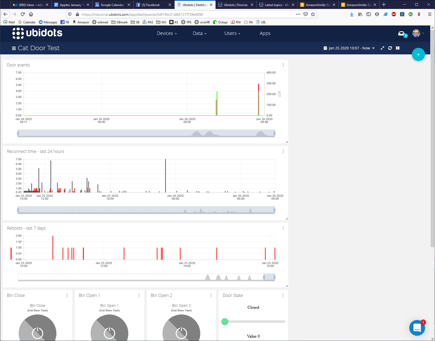
If I set the span to “last 24 hours”, I expect the right side of the x-axis to be the current time. That is not what actually happens. Instead the x-axis stops at the most recent dot. This is quite different from what you describe: “If you set 24 hours, the data reflected is the data received in the last 24 hours from the time you enter the dashboard”.
For example, in this screen capture, I reloaded the page on 01/26/2020 at 10:07. You can see that the right end of the x-axis on the Reboot chart is from 01/25/2020 at 16:00. That’s definitely NOT the “last 24 hours”.

You’re right. Allow me to complement my previous answer, the Line Chart widget will show the data received within the requested span (in this case the last 24h) and in case there is no data in the two edges (left and right) of the chart the span will be readjusted automatically to match the closer dots to the edges. The purpose of this is avoiding leaving blank spaces at each side of the graph.
Cheers,
Maria H.
Which brings me back to my original post…
I think this is wrong. If I had selected “last n dots” I would expect the behavior you describe. But if I select “last 24 hours” I EXPECT to see white space on the sides. The “adjustment” you describe is not “last 24 hours” and it should be optional or even a different setting. The point here is that I want all my charts to line up, so the data can be viewed in context.
(and yes I know I can create a variable and update it periodically - I am already doing that, but I don’t like having to do this and it creates a line on the chart that confuses people)
Please fix this.
thanks,
Will
Here’s an example - the two charts don’t line up, even though both are set to “last 24 hours”. I think they should!
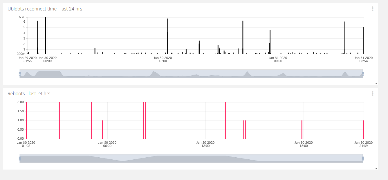
I fully understand your point, and we appreciate your comments on it. I will be sharing this thread with our PM to take this into consideration.
Cheers,
Maria H.
if you could just add a new option that would be great - the biggest challenge would seem to be what to call it…  maybe a switch like the one for SI.