Hello Ubidots!
We are really happy with the dashboards and we are going to be using them as a front end for a customer.
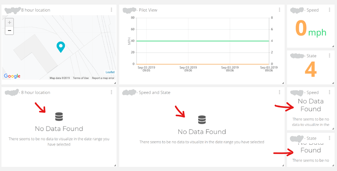
One concern however is the “No Data Found” text when there is no data in a range.
Our sales team is worried this text will scare the end user to thinking the device is damaged, (instead of it being more just the widget reporting in that it does not have data to render).
We would like it to say “Not Currently Available” or something similarly less alarming.
“No Data Found” sounds very serious to my ears,
“Not Currently Available” is much less concerning.
What would be the best way to modify the text here? Thanks!
