[SOLVED] - Rose chart or other widget to visualize vibration

Thank you for all things Ubidots!!

I am using a predictive maintenance sensor from NCD. It provides me vibration data with min x, y and z; max x, y and z; and rms x, y and z.

I would like to use a single Ubidots widget to visualize either:

  • rms of one axis, such as rms_x
  • all three vibration axes, rms_x, rms_y and rms_z

I tried using a rose chart widget but this does not seem to give me what I want. Is there a way to get the rose chart to show me something like this:

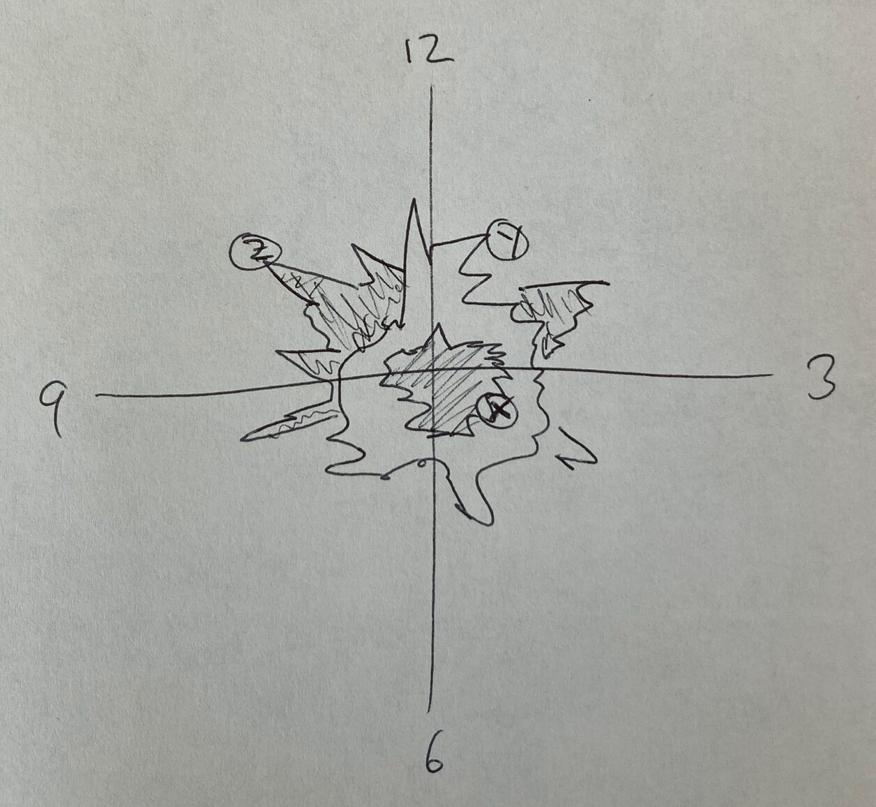
Or is there another widget I could use?

Or is this something I have to create using the HTML Canvas widget?

Thank you for any ideas and suggestions.

Good day @omep-developer,

I hope all is well.

Indeed it would be necessary to build this type of widget using the HTML canvas, as the rose chart only considers one magnitude and angle value. You can refer to the following article to learn how to create one.

Additionally, here you can find similar examples that would help you build the widget.

Finally, we offer professional services to develop custom widgets. If you are interested, we can explore this path.

All the best,
-Isabel

Thanks @isalogi . Sounds like a cool project for my students to dig into.

1 Like