I’m just new to Ubidots looking for an alternative to Xively after about 3 years. I have to say the ability to visualize my data in many different ways with Ubidots is fantastic!
I’m playing around with and evaluating a dashboard my remote Arduino based Solar Powered Security System with GSM connectivity and I think I have discovered a few problems with some of the Widgets:
For line charts with more than one variable (eg Battary Temp and Outside Temp), real time updating does not work. Gauges and single variable line charts all update in real time but charts with 2 or 3 of the same variables as my gauges and single variable line charts do not update. You have to refresh the browser to see an update on those charts.
Double axis charts (eg Battery Voltage and Battery Temp) do not display nice time and day values on the X axis when the data covers more than one day. The X axis time display should be the same as the line chart. As well, the floating window with the variable value and time stamp will display only one of the variables which is OK since you can move the cursor around to see the second variable values, but when you disable one of the variables by clicking on its associated colored dot you can still see the disabled variable values as you move the cursor over the graph area where the disabled graph would be. On line charts with more than one variable only enabled variables are visible.
I like the fact that you can resize the various widgets by pulling on the corner and they snap to the different sizes, but the only other gauge widget has only a very small size with overlapping digits available when editing from a PC based browser. Somehow I managed to generate a half horizontal sized but default full height gauge from my tablet as I switched from landscape to portrait mode. This size gauge is quite readable. For the life of me I cannot get my PC browser to snap to that size yet it will display that size for gauges I generated when editing the dashboard from my tablet. That size of gauge is very convenient for a stack of default sized graphs beside half sized gauges for viewing on a tablet in portrait mode.
I have verified these anomalies with IE, Chrome and Firefox on a PC, tablet and phone.
Hope you find these observations helpful. Keep up the good work!
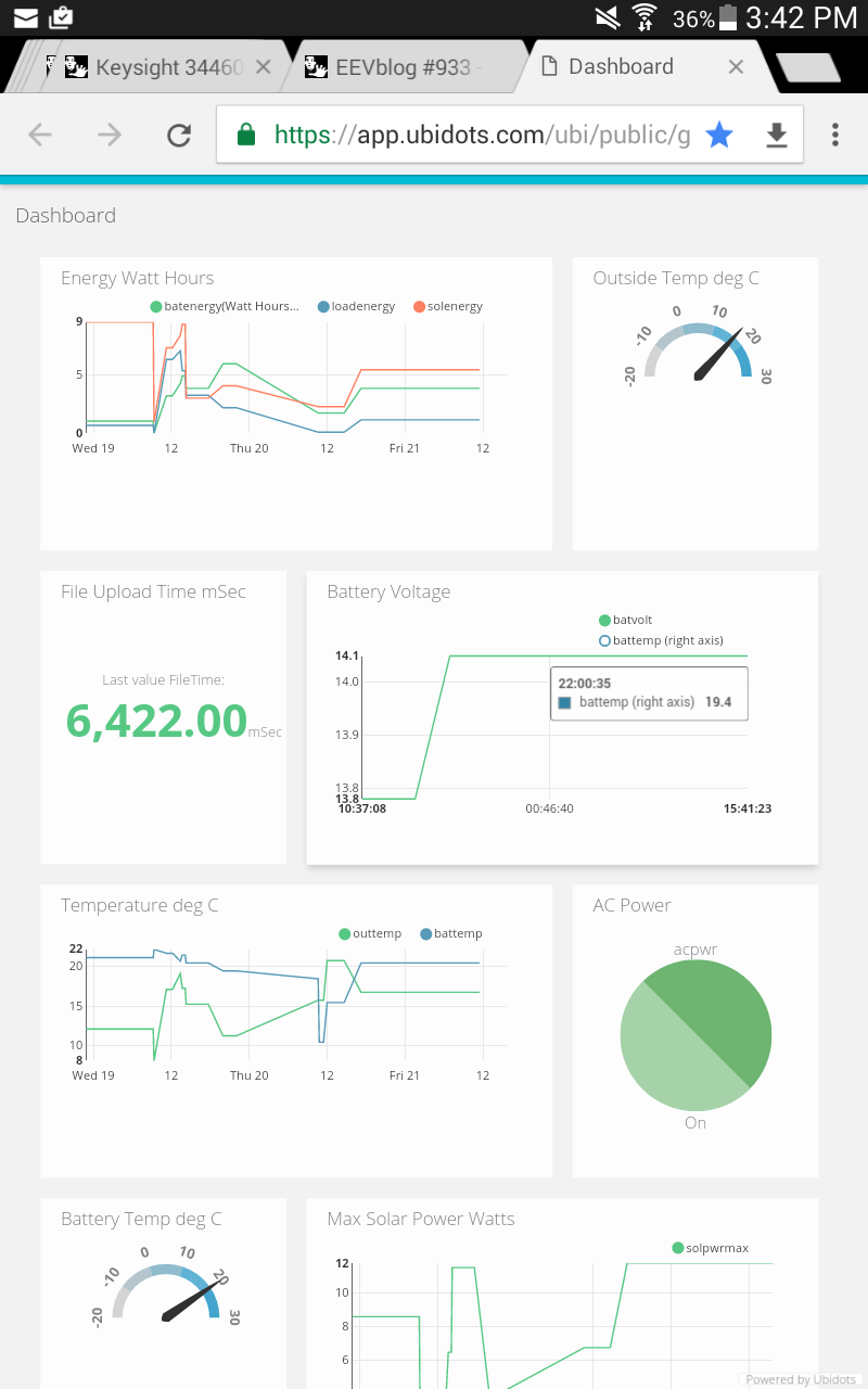
The attached screen shot from my tablet shows the anomalies.
if you look at the Energy graph and the Temperature graph, they were updated at a little before 12, but the Battery Voltage graph updates in real time and the last time was 15:41 for all values.
The Battery Voltage graph is a dual axis graph. Battery Temp is disabled in the browser by clicking on the blue dot. The floating window shows a battery temp value even though the graph is not visible. As well the X axis covers 3 days as in the other graphs but the display makes no sense.
The Outside Temp and Battery Temp gauges are 1/2 horizontal size. You can’t edit the gauge to be that size on a PC browser.
Great to hear. Sorry I have been away for the last while, but now I am back and ready to send live data. The good news is that I have noticed that the line charts with more than one variable now seem to update in real time. There may be another problem however. I haven’t been able to verify this but when I set the display points to 30, the auto scale function seems to look at all the data points in a variable beyond the 30 to set the scale. I think that the visible points on the graph is what the auto scale function should work with.
As for the dual axis graph, the X time scale is still not displaying time correctly for spans greater than a day. I have noticed that the floating window where you place the cursor does not display the time or date like the line charts do. Perhaps that is related o the problem with the X axis display. In addition, now that I have real data, the Y axis seems to only display values to 1 decimal place resolution when I supply 2 decimal places. The line charts display the 2 decimal points of precision.
A quick update. I was wrong about the auto scale function on the line charts. It does auto scale on the visible data. I had one point right on the origin axis which was causing the problem.
We will validate the possibility of changing the time scale in the eje X like the line chart and then send it to development.
We notify you once we develop and deploy it.