I have an IoT device (power monitor) that runs in-frequently, but sends data at 1-sec intervals in short bursts when it does. So may do nothing for an hour, and then burst 1 dot/sec for 30 secs, then again nothing for several minutes to hours. The total number of dots will be low, but the second-level detail is important to me.
The dots are ingesting correctly and I see in the variable that the individual second-level readings are there. But when I view the data in a line chart (amps v. volts v. watts), either on the variable itself or on a line-chart widget, the only data shown is “Last value”…not the second level detail. I also don’t see the data come in using live-view, again I think only last-value.
Is there a way to show this second-level detail visually, esp when showing multiple values?
Can you please let me know what are you referring to by saying second-level detail? to context data? if so, please refer to the following article to learn which widgets you can use to display context data in your Ubidots dashboard.
Additionally, any image or further explanation you can give us about the second-level detail would be of great help to understand what are you referring to and trying to achieve.
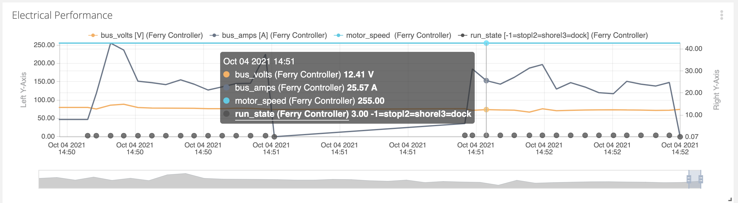
Hi Isabel - I sort of figured it out - in this time graph, the data points are at 3 second intervals and are visible if you zoom in far enough. However, the timescale itself doesn’t show the seconds, nor does the hover-box. But the data is there.
Thank you for your explanation. In that case, you can configure the date format that you want to use for an option that includes seconds, as shown in the image below.